
Notice
Recent Posts
Recent Comments
Link
| 일 | 월 | 화 | 수 | 목 | 금 | 토 |
|---|---|---|---|---|---|---|
| 1 | 2 | 3 | ||||
| 4 | 5 | 6 | 7 | 8 | 9 | 10 |
| 11 | 12 | 13 | 14 | 15 | 16 | 17 |
| 18 | 19 | 20 | 21 | 22 | 23 | 24 |
| 25 | 26 | 27 | 28 | 29 | 30 | 31 |
Tags
- Long Short Term Memory
- convolution
- 파이썬
- excel
- CBOW
- f1-score
- 1x1 Convolution
- 차원 감소
- docker
- dl
- 벡터 간 유사도
- deep learning
- nn.Module
- 분포 가설
- Charlse Severance
- pythonForEverybody
- GoogLeNet
- skip-gram
- Python
- 상호 정보량
- Multi-Layer Perceptron
- mlops
- Linear algebra
- 선형대수
- py4e
- 동시발생 행렬
- pytorch
- Gated Recurrent Unit
- 시소러스
- object detaction
Archives
- Today
- Total
Tech & TIL
Scatter Plot 본문
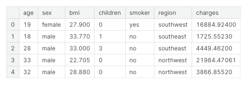
Data
Basic Scatter Plot
위 데이터 중 bmi와 charges를 scatter plot으로 시각화 해보자.
import seaborn as sns

sns.scatterplot(x=data['bmi'], y=data['charges'])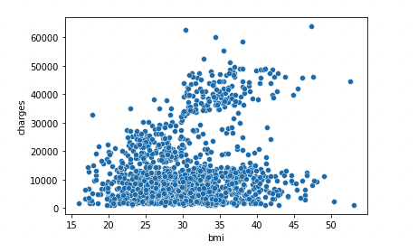
BMI와 Charges(보험금 청구료)는 어느정도 Positively Correlated 하다고 볼 수 있다. BMI가 높아질수록 Charges도 높아지기 때문.
확실하게 상관관계를 시각화하기 위해 Regression Line을 추가해보자.
회귀선을 추가하려면 regplot을 사용하면 된다.
sns.regplot(x=data['bmi'], y=data['charges'])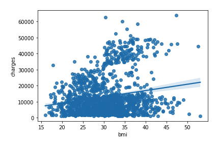
Color-coded Scatter Plot
bmi, charges, smoker 세 가지 변수를 한 번에 시각화하고 싶다면?hue를 사용하면 됨.
sns.scatterplot(x=data['bmi'], \
                y=data['charges'], \
                hue=data['smoker'])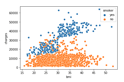
- 비흡연자보다 흡연자가 보험료를 더 많이 냄.
- BMI가 높고 흡연을 하는 사람들이 보험료를 가장 많이 냄.
2개의 Regression Line을 그리고 싶다면 lmplot을 사용하자.
sns.lmplot(x="bmi", y="charges", hue="smoker", data=data)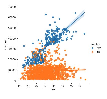
정리
일반적으로 scatter plot은 두 continuous variable 간의 관계를 보여주기 위해 사용한다(e.g. bmi & charges).
- sns.scatterplot
- x, y, hue
- sns.regplot (one reg line)
- lmplot (two reg lines)
'Data Science' 카테고리의 다른 글
| Bar charts & Heatmaps (0) | 2022.05.09 |
|---|---|
| Line Charts (0) | 2022.05.09 |
| F1 score란? (1) | 2022.05.09 |
'Data Science' Related Articles
more


Comments