
Notice
Recent Posts
Recent Comments
Link
| 일 | 월 | 화 | 수 | 목 | 금 | 토 |
|---|---|---|---|---|---|---|
| 1 | 2 | 3 | ||||
| 4 | 5 | 6 | 7 | 8 | 9 | 10 |
| 11 | 12 | 13 | 14 | 15 | 16 | 17 |
| 18 | 19 | 20 | 21 | 22 | 23 | 24 |
| 25 | 26 | 27 | 28 | 29 | 30 | 31 |
Tags
- 벡터 간 유사도
- nn.Module
- mlops
- py4e
- excel
- deep learning
- GoogLeNet
- dl
- pytorch
- 차원 감소
- 상호 정보량
- 선형대수
- pythonForEverybody
- 파이썬
- Charlse Severance
- f1-score
- Long Short Term Memory
- docker
- 시소러스
- skip-gram
- 동시발생 행렬
- Gated Recurrent Unit
- CBOW
- Multi-Layer Perceptron
- 분포 가설
- object detaction
- 1x1 Convolution
- convolution
- Linear algebra
- Python
Archives
- Today
- Total
Tech & TIL
Bar charts & Heatmaps 본문
Data

Index: Month
Columns: Airline Code
Bar chart
# Set the width and height of the figure
plt.figure(figsize=(10,6))

# Add title
plt.title("Average Arrival Delay for Spirit Airlines Flights, by Month")

# Bar chart showing average arrival delay for Spirit Airlines flights by month
sns.barplot(x=flight_data.index, y=flight_data['NK'])

# Add label for vertical axis
plt.ylabel("Arrival delay (in minutes)")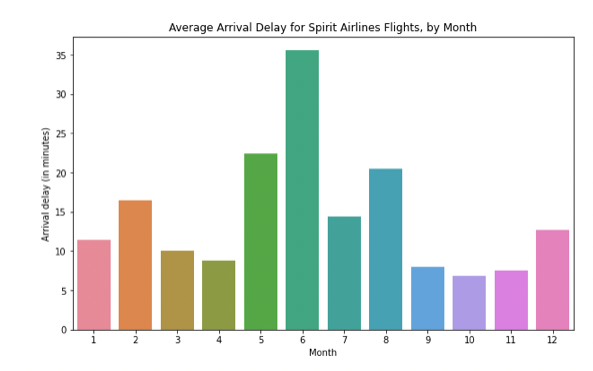
Heatmap
# Set the width and height of the figure
plt.figure(figsize=(14,7))

# Add title
plt.title("Average Arrival Delay for Each Airline, by Month")

# Heatmap showing average arrival delay for each airline by month
sns.heatmap(data=flight_data, annot=True)

# Add label for horizontal axis
plt.xlabel("Airline")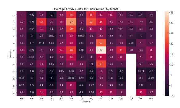
히트맵을 보면 상대적으로 연말에 (9-11월쯤) 어두운 것을 확인할 수 있다. 이것을 통해 평균적으로 항공사들은 연말에 스케줄을 잘 지킨다는 것을 알 수 있다. (i.e. 항공편이 Delay 되지 않는다.)
'Data Science' 카테고리의 다른 글
| Line Charts (0) | 2022.05.09 |
|---|---|
| Scatter Plot (0) | 2022.05.09 |
| F1 score란? (1) | 2022.05.09 |
'Data Science' Related Articles
more


Comments